Thursday, September 20, 2012

Holy cow!
It's been a very long time since my last post. I've been continuing to work on projects and I still draw all the time, I just haven't been remembering the blog!

So, hello blog, how have you been?

Me? I've been fine, I'm concocting some pretty big plans and I'll share them with you when the time is right. For now, check out some of my recent sketching and stuff...


The last one's in a pretty awkward state still, however, I'm excited for where it's going. This is gonna be a garbage pail kid rendition of me :)

Ok, well, peace out for now!

Monday, July 11, 2011

July's 2nd Sat outting and outdoor animation!

This was a fun one :) We sat out at washing park and drew tiny pictures in tiny frames for like 4 hours!


Monday, June 20, 2011

Second Saturday Sketching

ASIFA is sponsoring sketch outings called Second Saturday Sketching. This last one was at the parade :)
Here are some of my sketches:

Wednesday, June 1, 2011

Animation principles!


Hey all, I'm a big fan of the open source community because of the way information and learning is shared so freely and quickly and because the outcome of open source projects is usually quite excellent. Sharing ideas and collaborating with creative people really motivates me and helps me learn as well. I've been thinking a lot about how to apply the open source mentality to the animation community and finally it clicked. Share the info with others, the same way, duh! So here goes, I want to start by reviewing the animation principles and what better way to start then the ball bounce.

The two biggest things that we learn from a bouncing ball are the principles of timing and spacing. These two are essential to creating animation, they are quite literal in their names, timing deals with the amount of time it takes for something to happen. Spacing deals with the space between drawings or frames. The way you adjust the spacing within a given amount of time will have major effects on the way we perceive the movement. Experiment and play with your timing and spacing to see what happens and pay attention the the results! :)

Ok, a ball bounce is the perfect way to start thinking about animation. The best way to figure it all out is to reference the real thing and take notes on what you see. Make yourself aware of the arcs or path the ball follows, the speed of the bounces, listen to the sounds, time it out and write it all down. Picture it in your head and see of you can simply imagine that bounce, think about the change in force as gravity and inertia work their part and the ball eventually stops. How does it come to a stop, does it stop suddenly, does it roll backwards as it comes to rest? If you don't know, go back and watch it again and write that down.

To animate it, we will want to start at the most logical place, the beginning. To work through your animation it is best to start with the beginning and the end in mind, these two things are key to the process. 

Start by figuring out your timing, we work at 24 frames per second which means a 2 second ball bounce will require 48 frames total. (The drawings will actually hold for 1 extra frame each, this is called working on “2s” so of the 24 frames, we only draw 12 different drawings.) Put your first drawing at frame 1 and your last drawing at frame 48.


Next, draw the contact points for each bounce, this gives us all of the “key” frames. Without these drawings we can't express a bouncing ball, they have to be there and so this is the best thing to start with. It's also why their called key frames.

Something I learned about painting that seems to apply to anything I work on is to start big and work down to the small. So paint in the sky then the large shapes of the background and the different objects, working from big shapes, down to smaller ones until you finally get down to the detailing of individual things. This is true for animation too, the larger shapes are those key drawings and from here we will work our way down through extreme drawings or drawings that are pretty key and work off of the key drawings and then down to inbetween drawings that go between the keys and extremes. How do you eat an elephant? Yup, one bite at a time!

So the next step then is to add the ball at the tops of each arc, these are breakdowns and give us the full idea of how high each bounce goes. We are starting to see a nice pattern here and if we were to just go ahead without thinking it might seem natural to just add more balls, evenly spaced to fill the rest of the frames. So, this is where all that watching, thinking and note taking comes into play.

Remember the timing. When I observed a ball bouncing I saw that the first bounce took almost one second and the following bounces happened quicker and quicker. So, the timing should reflect those exact bounces. I tend to think of it in sounds and rhythms so in my head I play out a thunk...... thunk.... thunk... thunk.. thunk. I used a stop watch to time it so I'm referencing my notes on the timing while also thinking about that rhythm. My first guess at frame 24 was off and so I moved it over a bit, ahhh, better :)
 
Ok, we have some timing figured out and some basic spacing as well. The spacing going forward is going to really help us show the weight and mass of our ball. Drawings that are spaced more closely together will appear to move slower than drawings that are further apart. A ball could zip through the screen with only two or three drawings spaced far apart or slowly crawl cross the page by using many drawings spaced closely together.

When I observed the ball bouncing I noticed that the ball slowed down as it went up in the air and then sped up again as gravity pulled it back down and so forth. So I will use closer spacing on the drawings at the top of the arc and further spacing as the ball falls to the ground. 
Finally I'm looking at the rest of the inbetweens. I'll be keeping in mind the spacing as it relates to the movement. I like to start kind of mathematically here, then making small adjustments based on how the bounce seems to feel. Here is my final spacing after making a few more adjustments and what the bounce looks like animated :)

Next time we will look at squash and stretch on a bouncing ball :)

Monday, November 30, 2009

Letter Characters


I did this for my good friends at www.UrbanExpressions.org
I really enjoy working for them and I totally support their mission of education! Make sure that you check em out.

Sunday, August 30, 2009

The Principles of Animation applied to character design Pt. 1

I've been working on some character drawings for Urban Expressions and I thought that it would be interesting to use this as an opportunity to review the Principles of Animation as they relate to drawing characters.

The character design is wide open as they want me to basically just do my thing. This is both exciting and now, somewhat scary because I know what they like and I need to make sure that I deliver the goods! Fortunately its my style their after so really I just want to make sure and give em the best of "my thing" that I can. So, in come the principles...

First, here's a quick review of what those are (as explained by the acronym F.A.T.S.O.F.A.C.E, thanks Brian Larson for teaching me this one!):
Flexibility: This can relate to a flow/rhythm on the body, actual flexibility of character or parts...
Arcs: For natural movement to be conveyed, things move in arcs, hands are attached to arms which rotate at the shoulder. The motion of that rotation creates an arc of motion, not a straight path.
Timing and Spacing: This is the actual timing of one drawing to the next and the spacing of elements of these drawings.
Squash and Stretch: Helps define the mass and rigidity of an object. Harder objects have less squash and stretch than softer ones...
Overlapping Action: Not every part moves at the same time, typically, the body unfolds. This creates actions that overlap in motion.
Follow Through: This is the "finishing" of an action, instead of moving and coming to an abrupt halt, even as the main action stops, the lagging parts continue in motion to complete the action as a whole.
Anticipation: The preparation for an action, like leaning forward to build momentum for pushing back.
Counter Action: This is the actions of the secondary objects, like hair. Hair is moved only by the motion of the head and so follows "counter" to the heads movement.
Exaggeration: Pushing an idea, pose, expression... further to make it completely clear and readable.

These principles don't have to be in every drawing that you do but as you incorporate them and think about them, you will bring more life into your drawings. A character on a page becomes a character with a purpose and not just a poser.
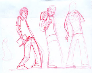
Ok, Here is my beginning. I generally start by trying to get some kind of a feel for what the character is, does, and believes in. I don't have any set rules, I just look for something that speaks to me on an emotional level.
These are roughs to help me try and find the character. I know that I want someone who is learning, open, and improving through practice.

I feel right off that the character is lacking some appeal (also a MAJOR part if animation and drawing in general. If you have little appeal, then you are going to loose you audience quickly.

So, I went back to the drawing board and came up with this:
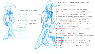
Some things that bug me right off the bat are that ideas like Overlapping action, follow through and counter action are really weak and washed out.

I also think that I can exaggerate his pose, posture and attitude to sell the character more.


Up Next, how to fix these issues!

Friday, August 21, 2009

Re-Awakening of my Blog and Doug Sweetland

So, I'll start by saying that my blog has been sadly neglected for waaaaay to long. Not because I've dropped out of animation, not because I don't still draw every day, but just because some things have changed in my life and I kind of left it all alone to sit and cry and wonder if ever I would return.

Well, I'm back. And because no one really reads my blog way, no one probably ever noticed. No biggie, but I'm back. :)

I'm taking this blog in a new direction now to help me journal my own progress in animation and hopefully collect my thoughts in a way that I can easily refer back to them...

On that note, here are some things that I've learned tonight about story from the Pixar animator/director, Doug Sweetland. (Thank you so much Doug for coming to Portland and talking to us, you KICK ASS!)

I'll start by saying that story is one of those things that just hurts me to do. I feel like my ideas don't make sense, aren't funny, and just don't connect in the right way to tell a good story. On the other hand, I LOVE story, good ones that is, and I wish I had a good idea of how to really create a good story.

Doug has helped open my eyes on some points that I have been unaware of or just not focused on.

1. Story is not a linear process, it is a free flowing process of ideas where you progress by throwing things away.

2. By putting in the work of developing those ideas that you'll probably just throw out, you may just stumble upon little gems that you might not really notice until you've been all the way through the process.Plus, sometimes it is the order of the story elements that is off and in working through them/re-arranging ideas, you can come up with a better, stronger whole.

3. Don't think that you know all the answers, let the answers tell you what they are when you finally get to them.

4. Ask for feedback, brutal, honest, feedback. If you aren't getting the reaction you hoped for, look more closely at what you have and throw out everything that doesn't work. But always get feedback, you don't know all the answers, ask others for their opinion and listen.

Doug explained the process that he went through in directing the short Presto and it really blew me away to hear how much he went through to get to such a wonderful little gem. Presto has that feeling of the classic Looney Tunes cartoons while still being done in 3D. It was one of the films that really got me excited about 3D again because of the fact that it wasn't trying to be some amazingly grand production but instead relied on the simplicity and beauty of the struggle between the two main characters. Pixar is pretty good about not trying to do super realistic 3D which is another thing I truly appreciate and the two ideas play together so well. It's no wonder that it is a product of some very hard work.

Thanks again Doug and please come back to Portland any time.